
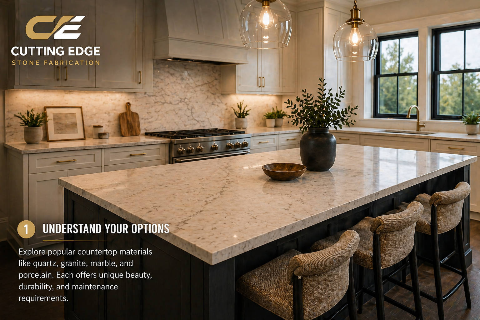
Choosing the perfect countertop color can feel easy at first. Most homeowners start by saying something like, “I want white quartz,” “I love the look of Taj Mahal quartzite,” or “I want something that does not show everything.” Then they walk into a showroom or slab yard and realize there are hundreds of different whites, creams, grays, blacks, beiges, taupes, gold veins, charcoal veins, warm backgrounds, cool backgrounds, bold patterns, soft patterns, natural stones, engineered stones, polished finishes, honed finishes, and slabs that look completely different in person than they looked online.
That is why countertop color selection deserves real attention. Your countertops are one of the largest visible surfaces in the kitchen. They connect your cabinets, backsplash, flooring, wall color, appliances, hardware, lighting, island, and overall style. The wrong color can make a beautiful kitchen feel disconnected. The right color can make the entire room feel finished, expensive, warm, and intentional.
For homeowners in Reading, Wyomissing, and throughout Berks County, the best countertop color is not always the trendiest color. It is the color that works with your home, your cabinets, your lighting, your lifestyle, and the way you actually use your kitchen. A kitchen in a bright new Wyomissing build may need a very different countertop than an older Reading home with darker floors, lower natural light, or warm wood trim. A family that cooks every day may choose differently than someone building a showpiece island for entertaining. A homeowner who wants timeless resale value may choose differently than someone who wants a bold, custom, one-of-a-kind stone.
This guide walks you through how to choose the right countertop color the smart way. Instead of guessing from a small sample or copying a photo online, you will learn how to evaluate undertones, cabinet colors, flooring, lighting, veining, material type, design style, maintenance expectations, and resale value. You will also learn which colors are trending in 2026, which colors are timeless, and which mistakes to avoid before you approve your slab.
At Cutting Edge Stone Fabrication, we help homeowners compare granite, quartz, quartzite, marble, and porcelain options every day. The goal is not to push one color on every kitchen. The goal is to help you make a confident decision that looks great on install day and still looks great years from now.
What Is Trending in Countertop Colors for 2026?
Countertop trends are shifting. For several years, bright white quartz and cool gray veining dominated many kitchen remodels. That look is still popular, especially for clean and modern kitchens, but the market is moving warmer. Across the design industry, the strongest 2026 direction is toward warm neutrals, natural materials, earthy tones, wood cabinetry, quartzite-inspired movement, soft gold or taupe veining, and countertops that feel more organic than sterile.
The National Kitchen and Bath Association’s 2026 kitchen trend reporting points to organic, neutral colors and natural materials staying very strong. It also notes that quartz remains a leading countertop material, with quartzite close behind. That matters because both quartz and quartzite give homeowners many of the color families people are asking for now: warm whites, soft creams, beige movement, taupe veining, sandy tones, subtle gold, and natural stone character.
Houzz’s 2026 countertop trend coverage highlights warm neutrals, quartzite-inspired designs, blue tones, textured finishes, and striking black surfaces as major directions. Cosentino’s 2026 design guidance also points to warmer neutrals like beige, taupe, creamy off-whites, and sandy tones leading modern palettes. These trends match what many homeowners are asking for in showrooms: they still want bright, clean kitchens, but they do not want them to feel cold.
That does not mean every homeowner should choose beige or cream. It means the best kitchens are becoming more layered. A white countertop may have warm taupe veining instead of icy gray. A black countertop may be paired with wood and brass so it feels rich instead of harsh. A quartzite island may become the statement piece, while the perimeter stays quieter. A porcelain slab may use subtle warm movement instead of a flat white background.
The biggest takeaway for Cutting Edge customers is simple: do not choose color in isolation. The best countertop colors are chosen as part of a full kitchen palette.
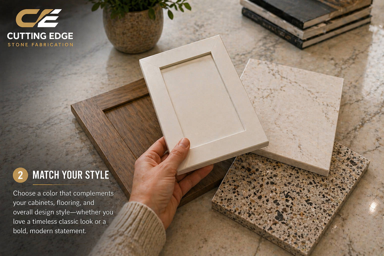
Start With the Cabinets First
The cabinets are usually the largest color block in the kitchen. They sit directly under the countertop, so the cabinet and countertop relationship matters more than almost anything else. Before you choose a countertop, be clear on your cabinet color, cabinet finish, and whether the cabinets have warm, cool, or neutral undertones.
If your cabinets are already installed, bring a cabinet door or sample to the showroom if possible. If your cabinets are being ordered, bring the exact color name, finish sample, or manufacturer information. Photos help, but a real sample is better because phone photos can distort the color.
White Cabinets
White cabinets are popular because they feel bright, clean, and timeless. They also give you many countertop options. You can go classic with white quartz, warm with cream or taupe veining, dramatic with black granite, high-end with quartzite, or soft with a warm neutral stone.
The biggest mistake with white cabinets is assuming all whites match. A cool white cabinet next to a creamy countertop can make the countertop look yellow. A warm white cabinet next to a stark white countertop can make the cabinets look dingy. This is why samples matter. You want the whites to relate to each other, not fight each other.
For white cabinets, strong countertop options include:
- Warm white quartz with taupe, beige, or soft gray veining.
- Quartzite with cream, gold, beige, or soft movement.
- Black granite or dark quartz for a high-contrast design.
- Light granite with natural movement for a more traditional look.
- Porcelain with marble-inspired veining for a clean modern look.
If you want a timeless kitchen, avoid choosing the brightest white countertop just because it looks clean on a sample board. In a real kitchen, a little warmth or movement often makes the space feel more expensive and more comfortable.
Cream or Off-White Cabinets
Cream cabinets need warmth. They usually pair better with creamy quartz, beige quartzite, warm granite, or soft taupe veining than they do with icy white and blue-gray tones. If the countertop is too cold, the cabinets may look yellow. If the countertop is too beige, the whole kitchen may feel flat. The best approach is to find a surface that has a related warm undertone but still gives some contrast.
Cream cabinets look beautiful with stones that have:
- Soft beige backgrounds.
- Champagne, gold, or taupe veining.
- Warm marble-inspired movement.
- Light quartzite patterns.
- Subtle brown or gray-brown details.
This palette is especially strong for homeowners who want a softer, more elegant kitchen instead of a stark modern look.
Natural Wood Cabinets
Natural wood cabinets are a major design trend again, especially white oak, walnut, rift-cut oak, and warm medium wood tones. With wood cabinets, countertop color selection is all about balancing warmth.
If the wood is already warm, a countertop with too much yellow, orange, or red can make the kitchen feel heavy. A creamy or warm white countertop often works well because it brightens the space without fighting the wood. A quartzite with beige, taupe, or soft gold movement can look very high-end with white oak. A black or charcoal countertop can work beautifully with walnut if the room has enough light.
Good choices for wood cabinets include:
- Creamy quartz with soft movement.
- Taj Mahal-style quartzite and other warm quartzites.
- Soft greige or taupe countertops.
- Black granite or dark quartz for contrast.
- Natural stone with warm veins and calm movement.
If you have wood floors and wood cabinets, be careful not to add a countertop that is also too busy and too warm. In that case, a quieter countertop may give the kitchen breathing room.
Gray Cabinets
Gray cabinets are still common, but they need to be handled carefully because many grays can feel cold. The safest way to update gray cabinets is usually to warm up the countertop. A warm white quartz, creamy quartzite, or taupe-veined surface can soften the room and keep it from feeling dated.
Cool gray cabinets can pair with cool white countertops, but that look is stronger when the homeowner wants a sleek modern style. If the kitchen has warm floors, warm lighting, or brass hardware, a countertop with warm veining will usually feel more balanced.
Good choices for gray cabinets include:
- Warm white quartz with subtle beige or taupe movement.
- Soft black or charcoal countertops for contrast.
- Light quartzite with warm undertones.
- Porcelain with soft gray and beige veining.
- Granite that includes gray but also has warmer mineral tones.
The main mistake is combining gray cabinets, gray floors, gray backsplash, and gray countertops. Too much gray can make the kitchen feel flat and cold. If you already have a lot of gray, use the countertop to add warmth, depth, or natural movement.
Navy, Green, or Blue Cabinets
Painted cabinets in navy, green, sage, or blue-gray can look beautiful with the right countertop. Since the cabinets already carry personality, the countertop should either support that color calmly or create a deliberate statement.
For navy cabinets, white or warm white countertops with gray, taupe, or gold veining can create a crisp, upscale look. For green cabinets, creamy stone, warm quartzite, soapstone-style dark surfaces, or marble-inspired quartz can work well. For blue-gray cabinets, avoid countertops that pull too yellow unless the entire palette is intentionally warm.
Good choices include:
- White quartz with controlled veining.
- Warm quartzite with beige and gold movement.
- Dark soapstone-look quartz or granite.
- Cream or greige surfaces.
- Porcelain with subtle movement.
With colored cabinets, bring the cabinet sample when choosing the slab. A green cabinet can change dramatically depending on whether it is sage, olive, forest, blue-green, or gray-green.
Black or Very Dark Cabinets
Dark cabinets make a strong statement. They can look luxury, modern, dramatic, or classic depending on what countertop you choose. A light countertop gives contrast and keeps the kitchen open. A dark countertop creates a moody, high-end look, but it requires good lighting and careful balance.
Dark cabinets pair well with:
- Warm white quartz.
- Creamy quartzite.
- Light marble-look porcelain.
- Taupe or greige countertops.
- Dark stone only when the room has enough light and contrast.
If you choose dark cabinets and a dark countertop, add warmth through wood, metal, lighting, backsplash, or flooring so the kitchen does not feel closed in.
Understand Undertones Before You Choose
Undertone is one of the most important parts of countertop color selection, and it is also one of the most overlooked. The surface color may look white, gray, beige, or black at first glance, but underneath that color is an undertone that affects how it looks next to everything else.
Common undertones include:
- Warm undertones: cream, yellow, beige, brown, taupe, gold, red, or orange.
- Cool undertones: blue, icy gray, green-gray, or purple-gray.
- Neutral undertones: balanced colors that do not strongly lean warm or cool.
A countertop can look beautiful by itself and still clash with your cabinets because the undertones do not work together. For example, a bright white quartz with blue-gray veins can look sharp and modern in one kitchen, but cold and disconnected in another kitchen with cream cabinets and warm oak flooring. A beige quartzite can look rich and natural with wood cabinets, but too yellow against a cool white cabinet.
The best way to test undertones is to place samples together in real light. Put the cabinet sample next to the countertop sample. Add the floor sample. Add hardware if you have it. Then look at the combination in daylight and under the lights you will use in the kitchen. If one piece suddenly looks too yellow, too gray, too pink, too green, or too dull, the undertone may be wrong.
Decide Whether You Want Contrast or Calm
Most great kitchens fall into one of two color strategies: contrast or calm.
Contrast means the countertop stands apart from the cabinets. Examples include white cabinets with black granite, navy cabinets with white quartz, walnut cabinets with creamy quartzite, or dark green cabinets with a light marble-look surface. Contrast creates energy and makes the countertop more noticeable.
Calm means the countertop blends closely with the cabinets and surrounding colors. Examples include cream cabinets with warm white quartz, white oak cabinets with soft quartzite, gray cabinets with greige stone, or white cabinets with subtle white-on-white quartz. Calm palettes feel softer, quieter, and often more timeless.
Neither approach is wrong. The right choice depends on the home and the homeowner. Choose contrast if you want:
- A bold kitchen.
- A statement island.
- A more modern or dramatic look.
- Strong definition between cabinets and countertops.
- A countertop that becomes a focal point.
Choose calm if you want:
- A soft and timeless kitchen.
- A warmer, more natural feel.
- A design that will not feel too busy.
- A kitchen that feels open and peaceful.
- A countertop that supports the full room instead of dominating it.
A common Cutting Edge recommendation is to keep the perimeter calmer and use the island as the statement piece if the homeowner wants drama without overwhelming the entire kitchen. This works especially well with quartzite, bold granite, or porcelain slabs with strong movement.
Think About Kitchen Size and Natural Light
The same countertop color can look completely different depending on kitchen size and light. A dark stone in a large, bright kitchen with big windows can look beautiful and rich. That same stone in a smaller kitchen with limited natural light can make the room feel smaller.
For smaller kitchens, galley kitchens, or spaces with limited daylight, lighter countertops usually help the room feel more open. That does not mean every small kitchen needs white quartz. Warm cream, light beige, pale greige, soft taupe, or a light quartzite can all brighten the space while still adding character.
For larger kitchens, you have more flexibility. You can use bolder veining, stronger contrast, darker stone, or a statement island without making the kitchen feel cramped. If your kitchen has a large island, the island color becomes especially important because it is often the first surface people notice.
Lighting type matters too. Warm bulbs can make cream, beige, and gold veins look richer. Cool bulbs can make white and gray surfaces look sharper. Natural light changes throughout the day. A countertop that looks perfect under showroom lights may look different in your home.
That is why one of the smartest steps is to bring samples into your kitchen or bring your home samples into the showroom. Lighting changes color. A professional showroom visit helps, but your actual home conditions matter too.
Choose Based on the Full Kitchen, Not One Sample
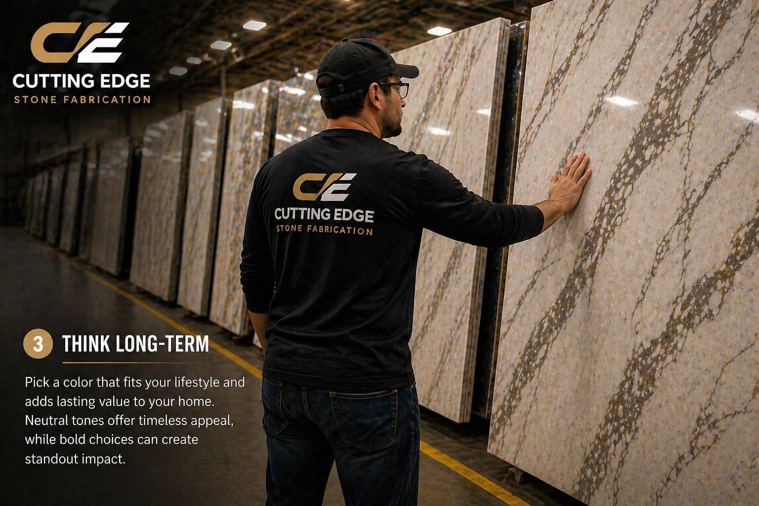
A small countertop sample can be helpful, but it can also be misleading. Many slabs have movement that does not show on a small sample. A four-inch piece may show only a quiet portion of the slab, while the full slab may have dramatic veining. Or the sample may show a strong vein that appears only once across the full slab.
This is especially true with granite, quartzite, marble, and porcelain slabs with large-format patterns. Natural stone is not uniform. Even quartz designs can have veining that changes across the slab. If you choose from a small sample only, you may not fully understand what will be installed in your kitchen.
The best process is:
- Narrow down your color family first.
- Look at samples to compare undertones.
- View larger pieces or full slabs when possible.
- Consider your layout and where the veins will fall.
- Talk through seam placement and island layout.
- Approve the actual slab when choosing natural stone.
Seeing full slabs matters because your countertop is not a tiny sample. It is a large surface that may run across a perimeter, island, peninsula, backsplash, waterfall edge, or bar area. The larger the surface, the more important the full slab becomes.
Countertop Color by Material Type
Different materials offer different color strengths. Before choosing a color, it helps to understand what each material does best.
Quartz Countertop Colors
Quartz is popular because it offers consistency, low maintenance, and a wide range of design options. If you want a clean white kitchen, a soft marble look, warm neutral veining, or a predictable pattern, quartz is often the easiest material to work with.
Quartz color families include:
- Bright white.
- Warm white.
- Cream.
- Gray.
- Greige.
- Taupe.
- Black.
- Marble-look veining.
- Concrete-look finishes.
- Soft gold or brown veining.
Quartz is a great choice for homeowners who want to know what they are getting. The color and pattern are usually more controlled than natural stone. That makes quartz especially strong for homeowners who want a consistent perimeter, matching pieces, or a clean modern look.
The main color caution with quartz is choosing a white that is too cold for your cabinets. Many older quartz styles leaned heavily gray. In 2026, warmer whites and softer veins are often more current and more flexible.
Granite Countertop Colors
Granite is a natural stone, so color can vary significantly from slab to slab. It can include flecks, mineral movement, waves, speckles, crystals, veins, and natural depth that engineered surfaces do not always match.
Granite color families include:
- Black and charcoal.
- White and gray.
- Brown and beige.
- Cream and gold.
- Blue, green, or red-toned specialty stones.
- Highly patterned natural movement.
Granite is great for homeowners who want a natural stone that is durable and unique. It can be traditional, rustic, dramatic, or very high-end depending on the slab. Black granite is especially timeless and can work in both modern and traditional kitchens.
The main color caution with granite is busyness. Some granite has a lot of movement or flecking. That can be beautiful, but it needs the right cabinets and backsplash. If the cabinets, floor, and backsplash are already busy, a very active granite may make the kitchen feel crowded.
Quartzite Countertop Colors
Quartzite is one of the most sought-after natural stones because it often gives homeowners the soft, flowing beauty they like in marble with more durability than marble. It is especially strong for warm, elegant kitchens.
Quartzite color families often include:
- Cream.
- Beige.
- Taupe.
- White.
- Gray.
- Soft gold.
- Brown movement.
- Green, blue, or dramatic specialty tones.
Taj Mahal-style quartzite has become extremely popular because it pairs beautifully with white oak, cream cabinets, warm white cabinets, brass hardware, and soft neutral palettes. Other quartzites can be much bolder, with dramatic veining and color movement.
The main color caution with quartzite is variation. You need to see the slab. Two slabs with the same name can look different. This is why slab selection matters so much.
Marble Countertop Colors
Marble is timeless and beautiful, but it requires realistic expectations. Many homeowners love marble because of its soft veining and classic look. However, marble can etch and patina over time, so it is not the right fit for everyone.
Marble color families include:
- White with gray veining.
- Cream with warm movement.
- Black with white veining.
- Green, burgundy, or other statement stones.
Marble is best for homeowners who love natural character and are comfortable with the stone changing over time. If you want the marble look without marble maintenance, quartz, porcelain, or quartzite may be better options.
Porcelain Countertop Colors
Porcelain offers very sleek, modern design options. It can mimic marble, concrete, natural stone, or solid colors. Porcelain can be especially strong for full-height backsplashes, waterfall islands, and modern kitchens.
Porcelain color families include:
- Marble-look white.
- Warm stone looks.
- Concrete and industrial looks.
- Dark dramatic slabs.
- Large-format veined designs.
The main color caution with porcelain is fabrication and edge detailing. Because porcelain is a specialized slab material, the fabricator matters. The right color and pattern should be selected with the final design, seams, edges, and backsplash in mind.
Match the Countertop to Your Backsplash Strategy
Your backsplash and countertop can either match, contrast, or quietly support each other. Before choosing a countertop color, think about what you want the backsplash to do.
If you want a simple tile backsplash, you can choose a countertop with more movement. A quiet subway tile, handmade tile, or simple neutral tile lets the countertop be the main feature. This works well with quartzite, dramatic granite, bold veining, or marble-look surfaces.
If you want a full-height slab backsplash, the countertop and backsplash become one continuous design. In that case, vein movement and color matter even more. A full-height backsplash can look extremely high-end, but it requires careful layout. You want the movement to feel intentional rather than random.
If your backsplash is already installed and you are only replacing countertops, bring a tile sample or detailed photos. The countertop must work with the existing backsplash. This is where undertones become critical. A tile that looks white may actually be warm, cool, greenish, gray, or creamy.
The safest rule is this: only one surface should be the loudest. If your countertop has bold veins, keep the backsplash quieter. If your backsplash is patterned, keep the countertop calmer. If both are bold, the kitchen can quickly feel busy.
Match the Countertop to Your Flooring
Flooring is often overlooked when choosing countertop color, but it can make or break the palette. Floors take up a large amount of visual space and usually have strong undertones.
Wood floors may be yellow, orange, red, brown, gray, or neutral. Tile floors may have beige, gray, cream, or patterned movement. Luxury vinyl can mimic wood or stone but still has a specific undertone. If the countertop ignores the floor, the kitchen may feel disconnected.
For warm wood floors, creamy white, taupe, warm quartzite, soft beige, or black countertops can work well. For gray floors, avoid making the whole kitchen gray unless you want a very cool modern look. Add warmth
with countertop veining, cabinet color, hardware, or wood accents. For patterned floors, keep the countertop simpler. For very dark floors, consider lighter countertops to lift the room.
If you are replacing floors as part of the remodel, choose the countertop and floor together. If the floors are staying, bring a sample or clear photo before choosing the slab.
Choose Veining Carefully
Veining is one of the biggest reasons homeowners fall in love with a countertop. It can make a kitchen feel custom, expensive, and natural. But veining needs to be chosen carefully.
Soft veining is easier to live with and works in more kitchens. It gives movement without taking over. Bold veining creates a statement and works best when the rest of the kitchen is controlled. Linear veining can make a kitchen feel longer or more directional. Cloudy or flowing movement feels softer and more organic. Speckled patterns can be practical, especially in granite, because they hide crumbs and daily use well.
When choosing veining, ask:
- Do I want the countertop to be the focal point?
- Will the veins fight with the backsplash?
- Does the vein color relate to my cabinet, floor, or hardware?
- Will the movement look good on my island size?
- Can the veins be laid out in a way that looks intentional?
If you love a bold slab, ask how it will be used in your actual layout. A dramatic vein may look amazing on a full slab but land awkwardly around a sink cutout if the layout is not discussed.
Decide Between Light, Medium, and Dark Countertops
Countertop color is not only about undertone. Value matters too. Value means how light or dark the surface is.
Light countertops make kitchens feel brighter, larger, and cleaner. They are great for smaller rooms, darker rooms, white cabinets, wood cabinets, and resale-friendly designs. They can show certain stains or marks depending on material, but they generally create a fresh and open feel.
Medium countertops are often the most forgiving. Greige, taupe, beige, warm gray, leathered granite, and soft natural stone can hide daily use better than pure white while still keeping the room from feeling dark.
Medium tones are excellent for busy families and warm transitional kitchens.
Dark countertops feel dramatic, rich, and grounded. Black granite, soapstone-look quartz, charcoal porcelain, and deep natural stone can be stunning. They work especially well with white cabinets, wood cabinets, and strong lighting. However, dark polished surfaces may show dust, fingerprints, crumbs, and water spots more than some homeowners expect.
Choose light if you want open and airy. Choose medium if you want warmth and practicality. Choose dark if you want drama and contrast.
Best Countertop Colors for White Kitchens
White kitchens remain popular because they are versatile and bright. The best countertop colors for white kitchens depend on whether you want classic, warm, modern, or dramatic.
For a classic white kitchen, choose white quartz with soft gray or taupe veining. This keeps the palette clean but gives enough movement to avoid looking flat.
For a warm white kitchen, choose cream, beige, warm quartzite, or quartz with gold or taupe movement. This is one of the strongest 2026 looks because it keeps the kitchen bright while making it feel warmer and more natural.
For a dramatic white kitchen, choose black granite, dark quartz, or a bold-veined surface. The contrast can be beautiful, especially with black hardware, brass hardware, or a statement island.
For a high-end white kitchen, choose quartzite. Natural movement gives the room depth and makes the kitchen feel more custom.
The key is to avoid a flat white-on-white look unless every other element has texture and warmth. A white kitchen needs depth through veining, wood, hardware, lighting, backsplash, or decor.
Best Countertop Colors for Wood Kitchens
Wood kitchens are coming back strongly because homeowners want warmth and natural texture. The best countertop colors for wood kitchens are usually warm whites, creams, quartzites, soft greiges, and carefully selected dark stones.
White oak looks beautiful with creamy quartz, warm quartzite, or soft taupe veining. Walnut looks beautiful with light quartzite, warm white quartz, or black stone. Cherry or reddish wood can be more difficult, because red undertones need to be balanced. In those kitchens, avoid countertops with strong yellow or orange tones unless the whole palette supports it.
For wood cabinets, the countertop should either brighten the wood or contrast it. If the countertop is too close to the wood color, the kitchen can feel heavy. A little contrast helps each material stand out.
Best Countertop Colors for Dark Kitchens
Dark kitchens can be beautiful, but they require balance. If you have black, charcoal, espresso, or deep green cabinets, a lighter countertop usually keeps the room from feeling too heavy. Warm white quartz, creamy quartzite, and light porcelain are great options.
If you want a dark-on-dark kitchen, make sure there is contrast in finish, lighting, metal, or backsplash. For example, black cabinets with a leathered black stone can feel very high-end if paired with warm wood shelves, brass hardware, and excellent lighting. Without those balancing elements, the room can feel flat.
Dark kitchens should be designed intentionally. Do not choose a dark countertop just because it looks great on a slab rack. Think about how much light your home gets, how large the room is, and whether the other finishes add enough warmth.
Best Countertop Colors for Busy Families
A busy family kitchen needs beauty, but it also needs forgiveness. If you cook often, have kids, entertain, or use the kitchen all day, you may want a surface that hides crumbs, fingerprints, and minor daily messes better than a flat solid color.
Good options include:
- Quartz with soft movement.
- Granite with natural speckling.
- Medium-toned quartzite.
- Warm greige quartz.
- Light surfaces with subtle veining.
- Leathered or honed finishes when appropriate.
Pure white and pure black can both show daily mess more than people expect. A little movement usually helps. You do not need a busy pattern, but you may want enough variation that the surface looks lived-in instead of constantly needing to be wiped.
What Colors Help With Resale Value?
If resale is important, choose a countertop that feels timeless and works with many styles. That usually means staying in a neutral family: warm white, soft white, cream, light gray, greige, taupe, black, or natural stone with balanced movement.
Resale-friendly does not have to mean boring. A warm quartzite can feel very high-end and still appeal to many buyers. A subtle marble-look quartz can feel fresh and classic. A black granite countertop can feel timeless in the right kitchen.
Be careful with colors that are very specific to your personal taste if you plan to sell soon. Bright blue, strong red, unusual green, or extremely dramatic stone can be beautiful, but it may narrow your buyer pool. If you love a bold look, consider using it on an island, bar area, powder room, or smaller feature instead of the entire kitchen.
Common Mistakes Homeowners Make When Choosing Countertop Color
- The first mistake is choosing from a photo only. Online photos are helpful for inspiration, but lighting, editing, filters, and screen settings can change the color dramatically.
- The second mistake is choosing from a small sample only. Small samples do not always show full movement, veining, or color variation.
- The third mistake is ignoring undertones. A countertop and cabinet can both be called white, but one may be warm and the other cool.
- The fourth mistake is choosing the countertop before confirming cabinets, floors, and backsplash. The countertop should be selected as part of the whole kitchen.
- The fifth mistake is using too many busy surfaces. Busy countertop, busy backsplash, strong floor pattern, and detailed cabinets can overwhelm the room.
- The sixth mistake is chasing a trend without considering the home. A trend that looks beautiful online may not work with your lighting, architecture, or existing finishes.
- The seventh mistake is not talking about seams and layout. Veining, island size, slab size, and seam placement all affect how the final color and pattern look.
- The eighth mistake is not visiting a showroom or slab yard. Countertops are a major investment. Seeing materials in person helps prevent regret.
A Simple Step-by-Step Process for Choosing Your Countertop Color
Step 1: Decide the overall kitchen feeling. Do you want bright and clean, warm and natural, bold and dramatic, traditional and timeless, or modern and sleek?
Step 2: Confirm the cabinets. Bring the exact cabinet sample, door, or color information.
Step 3: Look at flooring. Decide whether the floor is warm, cool, dark, light, busy, or simple.
Step 4: Choose a color family. Start broad: white, warm white, cream, gray, greige, beige, black, quartzite, granite, bold veining, or dark stone.
Step 5: Compare undertones. Place samples side by side and eliminate anything that makes another finish look wrong.
Step 6: Decide on movement. Choose quiet, medium, or dramatic veining based on the rest of the kitchen.
Step 7: Think about lifestyle. If the kitchen gets heavy use, choose something forgiving and practical.
Step 8: View larger pieces or full slabs. Do not approve a natural stone without understanding the actual slab.
Step 9: Discuss layout. Talk about islands, seams, sink cutouts, backsplashes, and edge details.
Step 10: Get a real estimate. Send a sketch, bring measurements, or schedule a price-out so the selected color fits your design and budget.
Local Advice for Reading, Wyomissing, and Berks County Homes
Homes in the Reading and Wyomissing area vary widely. Some kitchens are in older homes with warm trim, traditional layouts, and less natural light. Others are in newer homes with open floor plans, large islands, white oak cabinets, and bigger windows. That variety is why local guidance matters.
In older homes, the best countertop color often needs to respect existing woodwork, floors, and architecture. A stark white surface may feel out of place if the rest of the home is warm and traditional. Creamy quartz, granite, or quartzite may feel more natural.
In newer homes, homeowners often have more flexibility. Warm white quartz, quartzite islands, porcelain backsplashes, and bold veining can all work well because the kitchen is usually more open and connected to the living space.
In high-end Wyomissing kitchens, many homeowners want the countertop to feel custom. Quartzite, marble-look quartz, full-height backsplashes, waterfall islands, and warm natural palettes are strong choices.
In busy family kitchens throughout Berks County, practicality matters. Quartz, granite, and forgiving mid-tone surfaces are often smart choices because they balance style with everyday use.
The best local advice is to choose a countertop in person whenever possible. Bring cabinet, floor, backsplash, paint, and hardware samples to Cutting Edge. The more real information you bring, the better the final recommendation will be.
When to Choose a Statement Island
A statement island is one of the best ways to add personality without overwhelming the whole kitchen. You can keep the perimeter countertops calm and use the island for a bolder quartzite, granite, marble-look porcelain, or dramatic quartz.
This works well when:
- The island is large.
- The perimeter cabinets are simple.
- The backsplash is quiet.
- The homeowner wants a wow factor.
- The kitchen is open to the living area.
A statement island can also help control budget because the premium material may be used only on the island while the perimeter uses a more cost-effective or subtle surface.
If you choose two countertop colors, make sure they relate. They should share an undertone, vein color, cabinet connection, or design style. Two unrelated stones can look accidental.
How Hardware and Fixtures Affect Countertop Color
Hardware may seem small, but it affects the full palette. Brass and gold hardware pair beautifully with warm whites, beige veining, quartzite, cream, taupe, green cabinets, navy cabinets, and walnut. Black hardware works well with white quartz, gray cabinets, modern kitchens, and high-contrast designs. Nickel and chrome feel cleaner and cooler, which can work well with white, gray, and modern palettes.
If your countertop has gold veining, brass hardware may pull the warmth out beautifully. If your countertop has gray veining, polished nickel or chrome may feel more connected. If your countertop is black, brass can warm it up, while black hardware can make the room feel more modern and minimal.
You do not need every metal to match perfectly, but the metals should feel intentional.
Finish Matters: Polished, Honed, or Leathered
Color can look different depending on finish. A polished finish reflects more light and can make colors appear brighter or deeper. A honed finish is softer and more matte, which can make a kitchen feel relaxed and high-end. A leathered finish adds texture and can be especially beautiful on certain granites and dark stones.
Polished finishes are common and classic. Honed finishes can be beautiful but may show oils, marks, or fingerprints differently depending on material. Leathered finishes can add depth and hide some daily use, but they are not right for every stone or every homeowner.
When choosing color, look at the finish too. A black polished granite and a black leathered granite can feel like two completely different design choices.
The Best Color Choice Is the One You Understand
A countertop should not be a guess. You should understand why the color works with your cabinets, why the undertone is right, why the movement fits your layout, why the material matches your lifestyle, and why the final slab is the one you want installed.
The perfect countertop color is not always the most expensive color. It is not always the trendiest color. It is not always the color with the most dramatic veining. It is the color that makes your whole kitchen feel connected.
If you are unsure, that is normal. Countertop selection is a big decision. The smartest step is to compare materials in person with someone who understands fabrication, installation, layout, seams, and design.
Ready to Choose Your Countertop Color?
If you are planning a kitchen remodel in Reading, Wyomissing, or anywhere in Berks County, Cutting Edge Stone Fabrication can help you choose the right countertop color for your kitchen, lifestyle, and budget.
You can get started by sending us a sketch or layout, bringing in cabinet and flooring samples, or stopping into the showroom to compare materials in person. We can walk you through granite, quartz, quartzite, marble, and porcelain options, explain what will work best with your design, and help you avoid costly color mistakes.
Your countertop is one of the most important decisions in your kitchen. Make sure you choose it with confidence.
QUICK HOMEOWNER CHECKLIST
Before choosing your countertop color, gather:
- Cabinet sample or cabinet color name.
- Flooring sample or clear photo.
- Backsplash sample if already selected.
- Wall paint color if known.
- Hardware finish.
- Appliance finish.
- Kitchen layout or sketch.
- Island dimensions if applicable.
- Inspiration photos.
- Notes on whether you want bright, warm, bold, natural, modern, or timeless.
Bring these items to Cutting Edge and the color selection process becomes much easier.
FAQ: Choosing Countertop Colors
What is the safest countertop color for resale?
Warm white, soft white, cream, greige, taupe, light quartzite, and classic black are usually among the safest choices. They feel timeless and work with many cabinet styles. If you are remodeling for resale, avoid extremely unusual colors unless they are used in a smaller feature area.
Are white countertops still popular?
Yes, white countertops are still popular, but the most current whites are often warmer and softer than the icy white and cool gray looks that dominated several years ago. Warm white quartz, creamy quartzite, and soft taupe veining are especially strong.
What countertop color hides mess the best?
Medium tones and surfaces with subtle movement are often the most forgiving. Granite with natural speckling, quartz with soft veining, greige quartz, and warm quartzite can hide daily crumbs and minor marks better than pure white or polished black.
Should my countertop match my cabinets?
It does not need to match exactly. In fact, a little contrast often looks better. The countertop should coordinate with the cabinets through undertone, style, and overall palette. Matching too closely can sometimes make the kitchen feel flat.
Should my island be a different countertop color?
It can be. A different island color works well when the island is meant to be a focal point. The two surfaces should still relate through undertone, veining, cabinet color, or design style.
Is quartz or quartzite better for color selection?
Quartz is better if you want consistency and low maintenance. Quartzite is better if you want natural movement and a premium one-of-a-kind look. Both offer beautiful colors, but they serve different design goals.
What countertop color works best with white cabinets?
White cabinets work well with warm white quartz, soft marble-look quartz, creamy quartzite, black granite, light granite, and porcelain with subtle veining. The key is matching undertones so the whites do not clash.
What countertop color works best with wood cabinets?
Wood cabinets often look best with creamy quartz, warm quartzite, soft greige, taupe veining, or black stone for contrast. Avoid adding too many similar warm tones unless the palette is very carefully planned.
Do countertops look different after installation?
They can. A countertop may look different once it is installed under your lighting, next to your cabinets, and across a large surface area. That is why seeing full slabs and comparing samples in real conditions matters.
Should I choose countertop color before backsplash?
Usually, yes. The countertop is a larger investment and often has more movement. Once the countertop is selected, the backsplash can be chosen to support it.
Can Cutting Edge help me choose a color if I only have a rough sketch?
Yes. A rough sketch, cabinet information, and a few inspiration photos are enough to start narrowing down options. For accurate pricing, measurements and layout details are important, but you do not need everything finalized to begin the conversation.
What should I bring to the showroom?
Bring cabinet samples, flooring samples, backsplash ideas, paint colors, hardware finishes, appliance finishes, photos of your kitchen, and a layout or sketch. The more information you bring, the easier it is to choose the right countertop color.